
- 164浏览
- 2022-09-10
本文介绍几个常见的鼠标悬停效果。这几个效果比较相近,主要是当鼠标移到和移出按钮时,按钮边框颜色或阴影的变化效果。
下面是一个按钮的悬停效果的CSS和HTML代码,代码并不多,并且不需要用到高深的技术。
CSS
.button {
  flex: 1 1 auto;
  margin: 10px;
  padding: 20px;
  border: 2px solid #f7f7f7;
  text-align: center;
  text-transform: uppercase;
  position: relative;
  overflow: hidden;
  transition: 0.3s;
}
.button:after {
  position: absolute;
  transition: 0.3s;
  content: "";
  width: 0;
  left: 50%;
  bottom: 0;
  height: 3px;
  background: #f7f7f7;
}
.button:hover {
  cursor: pointer;
}
.button:hover:after {
  width: 100%;
  left: 0;
}
<div class="button">Center -> out</div>效果
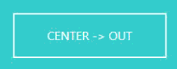
代码解释
.button:after 是CSS的伪元素,是按钮的初始样式。
transition: 0.3s; 是动画速度。
content: ""; 表示填充内容为空。
left: 50%; 表示位置在中间。
bottom: 0; 这是位置定位,在div底部。
.button:hover:after 是鼠标移到按钮上时的样式。
width: 100%; 表示鼠标移到按钮上时宽度变为100%。
left: 0; 位置定位,在div左边。
完整css代码
body {
  background: linear-gradient(135deg, #55efcb 0%, #1e5799 0%, #55efcb 0%, #5bcaff 100%);
  color: #f7f7f7;
  font-family: "Lato", sans-serif;
  font-weight: 300;
}

.container {
  display: flex;
  justify-content: center;
  align-items: center;
  align-content: center;
  flex-wrap: wrap;
  width: 60vw;
  max-width: 1200px;
  margin: 0 auto;
  min-height: 100vh;
}

.button {
  flex: 1 1 auto;
  margin: 10px;
  padding: 20px;
  border: 2px solid #f7f7f7;
  text-align: center;
  text-transform: uppercase;
  position: relative;
  overflow: hidden;
  transition: 0.3s;
}
.button:after {
  position: absolute;
  transition: 0.3s;
  content: "";
  width: 0;
  left: 50%;
  bottom: 0;
  height: 3px;
  background: #f7f7f7;
}
.button:nth-of-type(2):after {
  left: 0;
}
.button:nth-of-type(3):after {
  right: 0;
  left: auto;
}
.button:nth-of-type(4):after {
  left: 0;
  bottom: auto;
  top: -3px;
  width: 100%;
}
.button:nth-of-type(5):after {
  height: 120%;
  left: -10%;
  transform: skewX(15deg);
  z-index: -1;
}
.button:hover {
  cursor: pointer;
}
.button:hover:after {
  width: 100%;
  left: 0;
}
.button:hover:nth-of-type(4):after {
  top: calc(100% - 3px);
}
.button:hover:nth-of-type(5) {
  color: #5bcaff;
}
.button:hover:nth-of-type(5):after {
  left: -10%;
  width: 120%;
}
.button:hover:nth-of-type(6) {
  border-radius: 30px;
}
.button:hover:nth-of-type(6):after {
  width: 0%;
}
.button:hover:nth-of-type(7) {
  transform: scale(1.2);
}
.button:hover:nth-of-type(7):after {
  width: 0%;
}
.button:hover:nth-of-type(8) {
  box-shadow: inset 0px 0px 0px 3px #f7f7f7;
}
.button:hover:nth-of-type(8):after {
  width: 0%;
}
.button:hover:nth-of-type(9) {
  box-shadow: 0px 0px 0px 3px #f7f7f7;
}
.button:hover:nth-of-type(9):after {
  width: 0%;
}
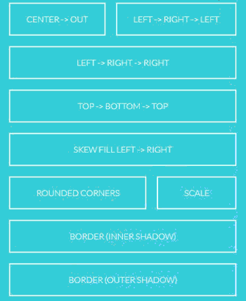
 <html>
<body>
  <div class="container">
    <div class="button">Center -> out</div>
    <div class="button">Left -> Right -> Left</div>
    <div class="button">Left -> Right -> Right</div>
    <div class="button">Top -> Bottom -> Top</div>
    <div class="button">Skew Fill Left -> Right</div>
    <div class="button">Rounded Corners</div>
    <div class="button">Scale</div>
    <div class="button">Border (Inner Shadow)</div>
    <div class="button">Border (Outer Shadow)</div>
  </div>
</body>
</html>
版权声明:
1、本文系转载,版权归原作者所有,旨在传递信息,不代表看本站的观点和立场。
2、本站仅提供信息发布平台,不承担相关法律责任。
3、若侵犯您的版权或隐私,请联系本站管理员删除。
4、本文由会员转载自互联网,如果您是文章原创作者,请联系本站注明您的版权信息。


 中国互联网举报中心