

- 208浏览
- 2022-05-25
感觉css的话,原来的我认为很难学,挺生涩的,但是认真看了以后,感觉css很有意思,能写出很多好看的样式,只要多做几个例子,其中有哪个属性不明白,自己查明白,然后把做出来的东西从头到尾顺一遍,思路就会清晰一些,css基础的东西挺简单,就看你会不会利用回了。
html代码:
<!DOCTYPE html>
<html lang="en">
<head>
    <meta charset="UTF-8">
    <meta name="viewport" content="width=device-width, initial-scale=1.0">
    <title>Document</title>
    <link rel="stylesheet" href="css/鼠标悬停.css">
</head>
<body>
    <div class="main">
        <div class="item">
            <div class="info">
                <h3>use what you have</h3>
                <p>by Angela Duncan <a href="#">view on more</a></p>
            </div>
        </div>

        <div class="item">
            <div class="info">
                <h3>use what you have</h3>
                <p>by Angela Duncan <a href="#">view on more</a></p>
            </div>
        </div>

        <div class="item">
            <div class="info">
                <h3>use what you have</h3>
                <p>by Angela Duncan <a href="#">view on more</a></p>
            </div>
        </div>

    </div>
</body>
</html>
*{
margin: 0;
padding: 0;
box-sizing: border-box;
}
a{
text-decoration: none;
}
body,html{
width: 100%;
height: 100%;
}
/* body{
background: #f9f9f9 url(../images/bd.jpg);
} */
.main{
width: 100%;
height: 100%;
display: flex;
justify-content: center;
align-items: center;
}
.item{
position: relative;
width: 220px;
height: 220px;
margin: 10px;
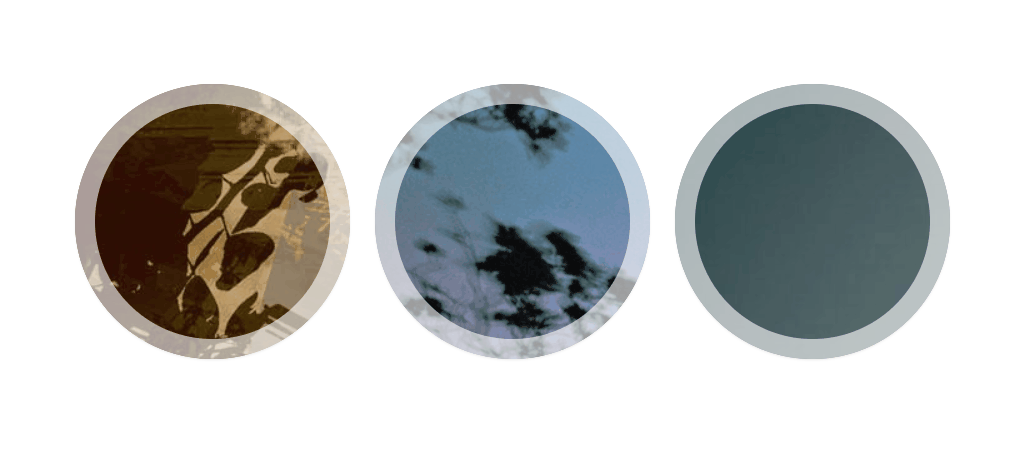
background: url(../images/4.jpg) no-repeat;
border-radius: 50%;
box-shadow: inset 0 0 0 16px rgba(255,255,255,.6),0 1px 2px rgba(0,0,0,.1);
transition: all .4s ease-in-out;
}
.item:nth-child(2){
background: url(../images/2.jpg) no-repeat;
}
.item:nth-child(3){
background: url(../images/3.jpg) no-repeat;
}
.info{
opacity: 0;
transform: scale(0);
position: absolute;
width: 100%;
height: 100%;
background: rgba(63, 147, 147,.8);
border-radius: 50%;
text-align: center;
transition: all .4s ease-in-out;
}
.info h3{
height: 140px;
font-size: 22px;
color: #fff;
margin: 0 30px;
padding-top: 45px;
text-transform: uppercase;
letter-spacing: 2px;
}
.info p{
opacity: 0;
font-size: 12px;
color: #fff;
/* 文字倾斜 */
font-style: italic;
margin: 0 30px;
padding-top: 10px;
border-top: 1px solid rgba(255,255,255,.5);
transition: all .4s ease-in-out .4s;
}
.info a{
display: block;
color:#fff ;
font-style: normal;
}
.item:hover{
box-shadow: inset 0 0 0 1px rgba(255,255,255,.1),0 1px 2px rgba(0,0,0,.1);
}
.item:hover .info{
opacity: 1;
transform: scale(1);
}
.item .info p{
opacity: 1;
}
.info p a:hover{
color: #fff222;
}
版权声明:
1、本文系转载,版权归原作者所有,旨在传递信息,不代表看本站的观点和立场。
2、本站仅提供信息发布平台,不承担相关法律责任。
3、若侵犯您的版权或隐私,请联系本站管理员删除。
4、本文由会员转载自互联网,如果您是文章原创作者,请联系本站注明您的版权信息。


 中国互联网举报中心