
- 224浏览
- 2022-05-08
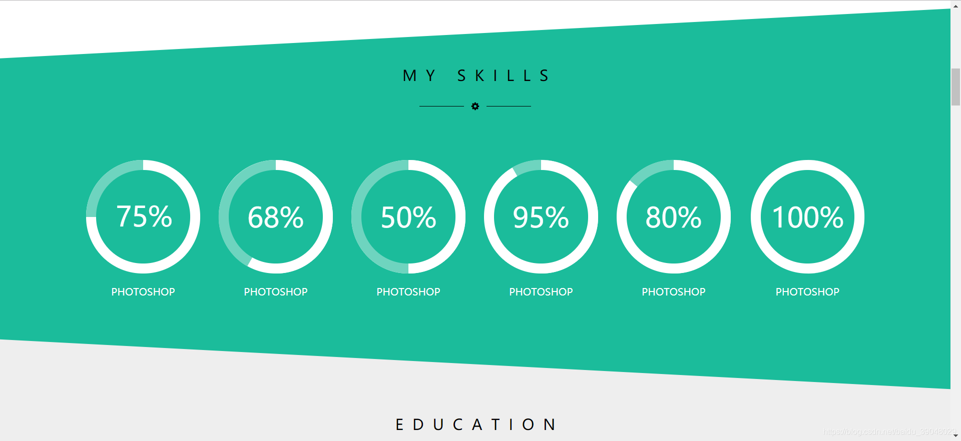
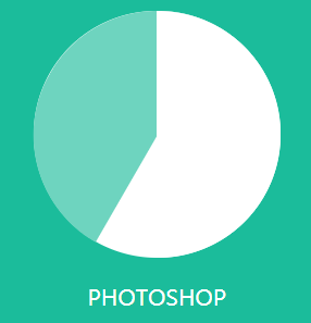
先来看一下效果图:
具体实现步骤:
先画一个大圆,底色为#ffffff;
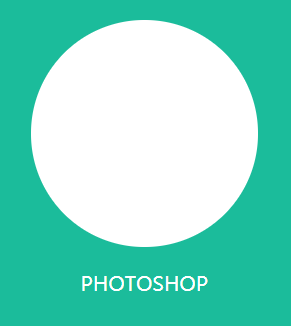
<div class="third"> </div>.third{
background-color: #FFFFFF;
width: 182px;
height: 182px;
border-radius: 50%;
position: relative;
}
2.再画一个浅绿色的圆和一个与与第一个圆一样的圆
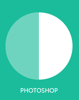
<div class="third">
           <div class="second"></div>
           <div class="first"></div>
</div>
.second{
    background-color: #6ED4BF;
    width: 182px;
    height: 182px;
    border-radius: 50%;
    clip:rect(0,91px,auto,0);
    position: absolute;
}
.first{
    background-color: #FFFFFF;
    width: 182px;
    height: 182px;
    border-radius: 50%;
    clip:rect(0,auto,auto,91px);
}
3.将second圆根据百分比旋转
.second{
    background-color: #6ED4BF;
    width: 182px;
    height: 182px;
    border-radius: 50%;
    clip:rect(0,91px,auto,0);
    position: absolute;
    transform: rotate(30deg);  //旋转30度
}
4.最后再画一个小圆,写上百分比
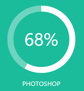
 <div class="third">
          <div class="second"></div>
          <div class="first"></div>
          <div class="mask">
               <span>68%</span>
          </div>
  </div>
.third *{
position: absolute;
top: 0;
right: 0;
bottom: 0;
left: 0;
}这样圆就是在中心了
.mask>span{
    display: block;
    font-size: 44px;
    color: white;
    line-height: 150px;
}
版权声明:
1、本文系转载,版权归原作者所有,旨在传递信息,不代表看本站的观点和立场。
2、本站仅提供信息发布平台,不承担相关法律责任。
3、若侵犯您的版权或隐私,请联系本站管理员删除。
4、本文由会员转载自互联网,如果您是文章原创作者,请联系本站注明您的版权信息。


 中国互联网举报中心